


23
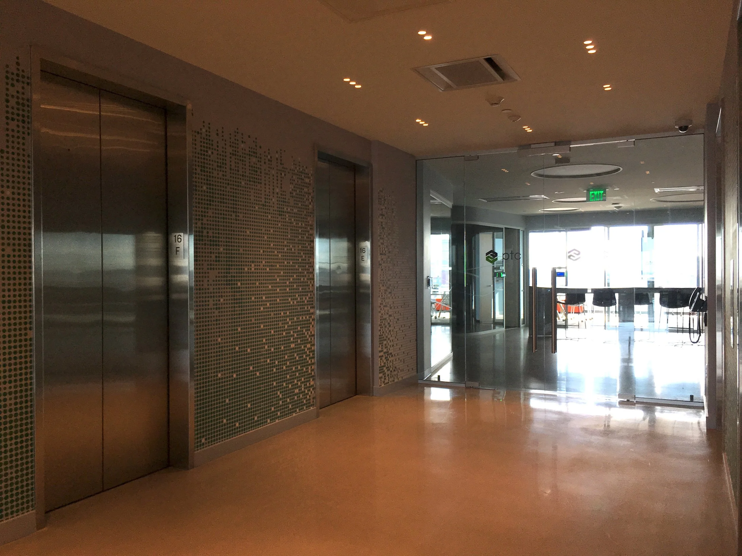
PTC
15
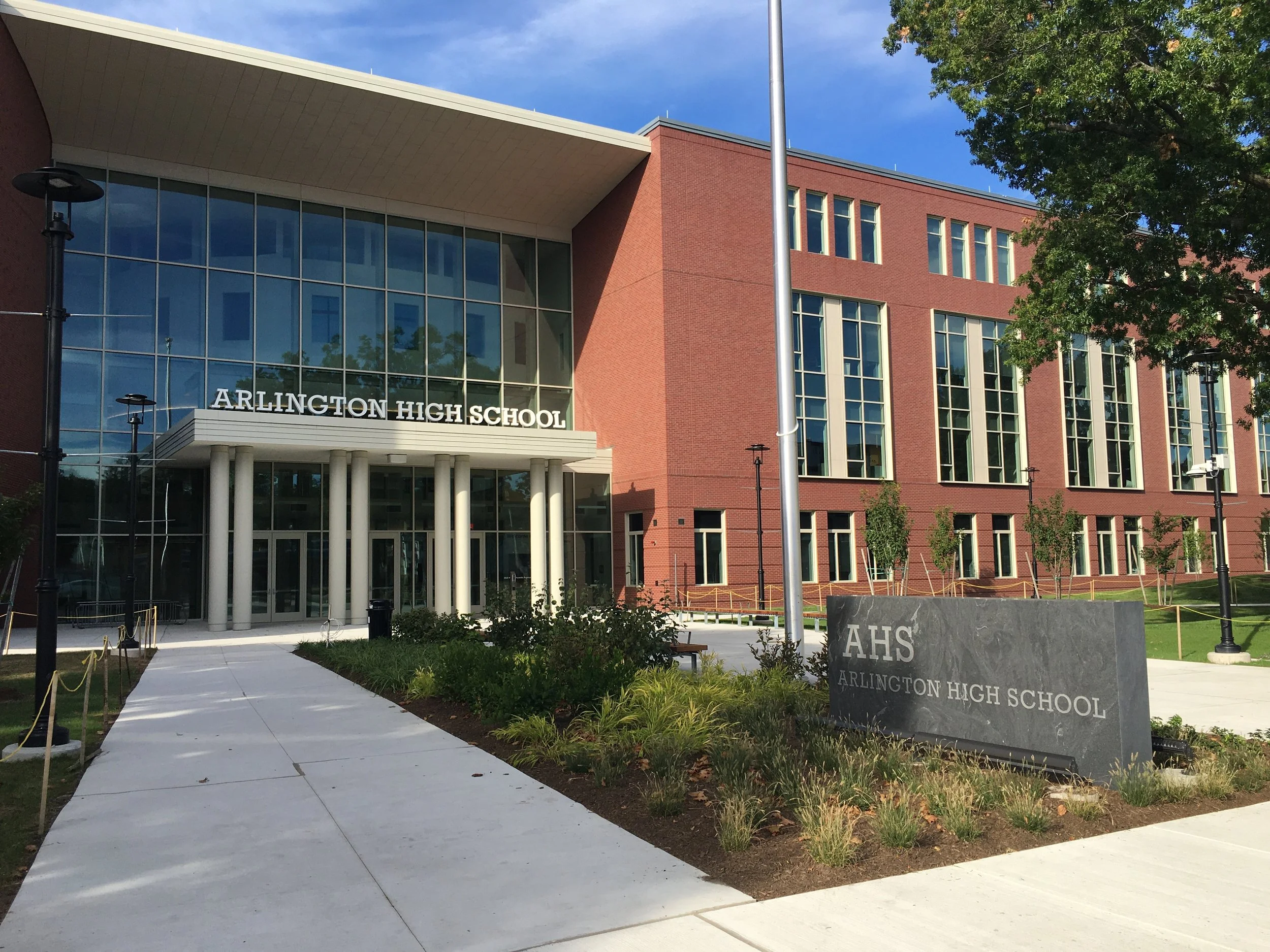
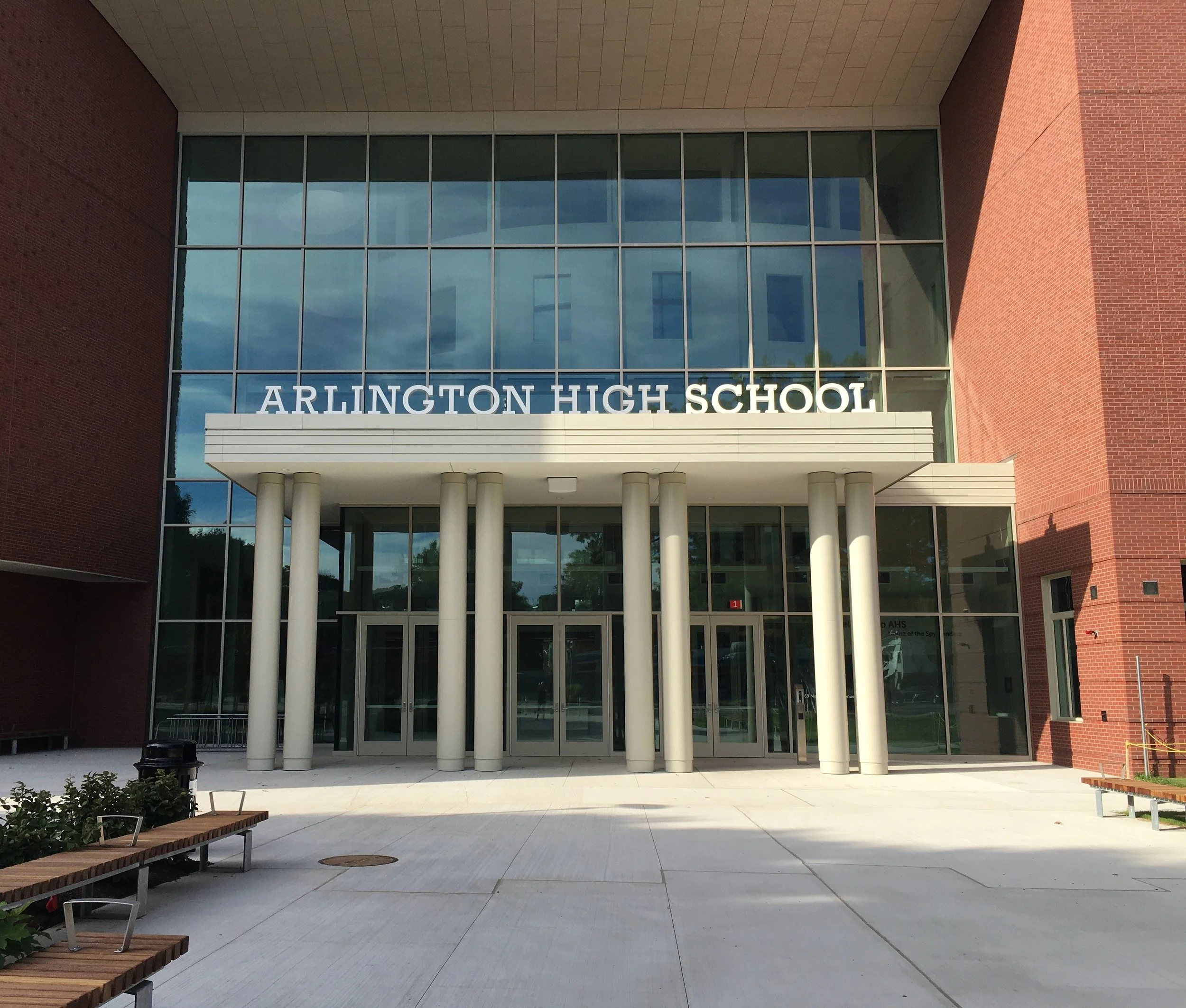
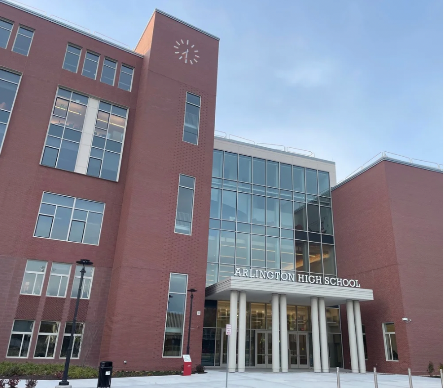
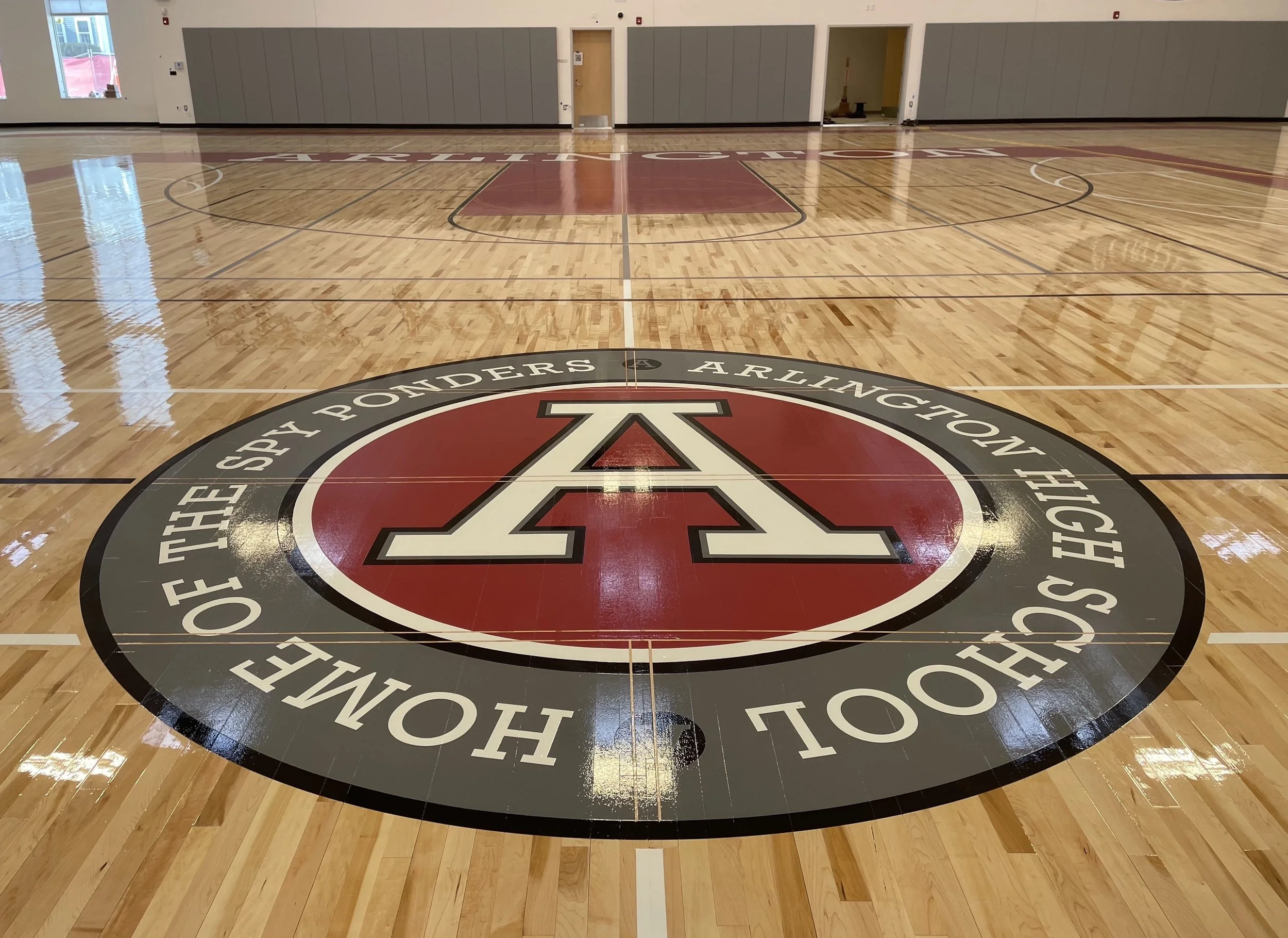
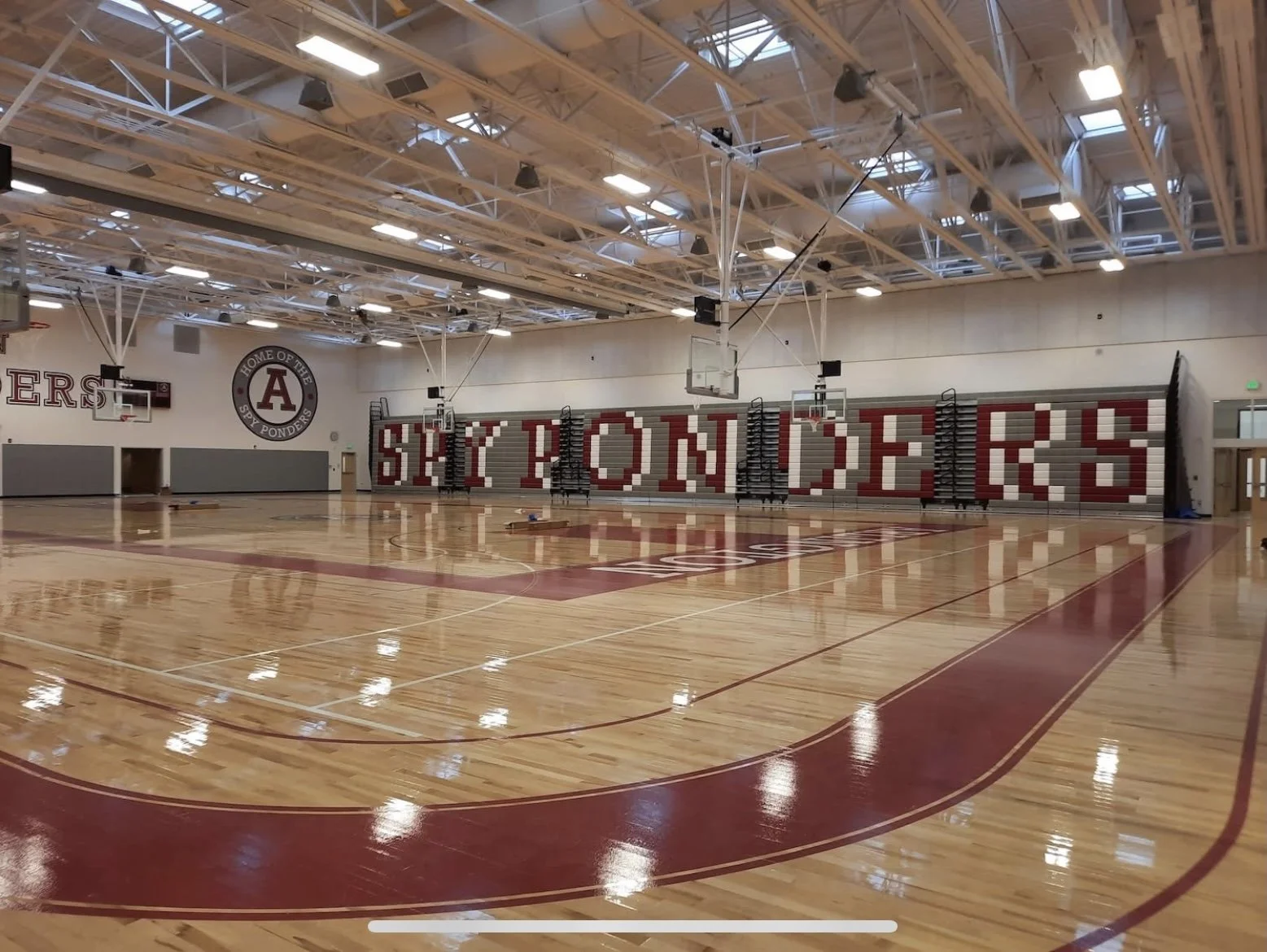
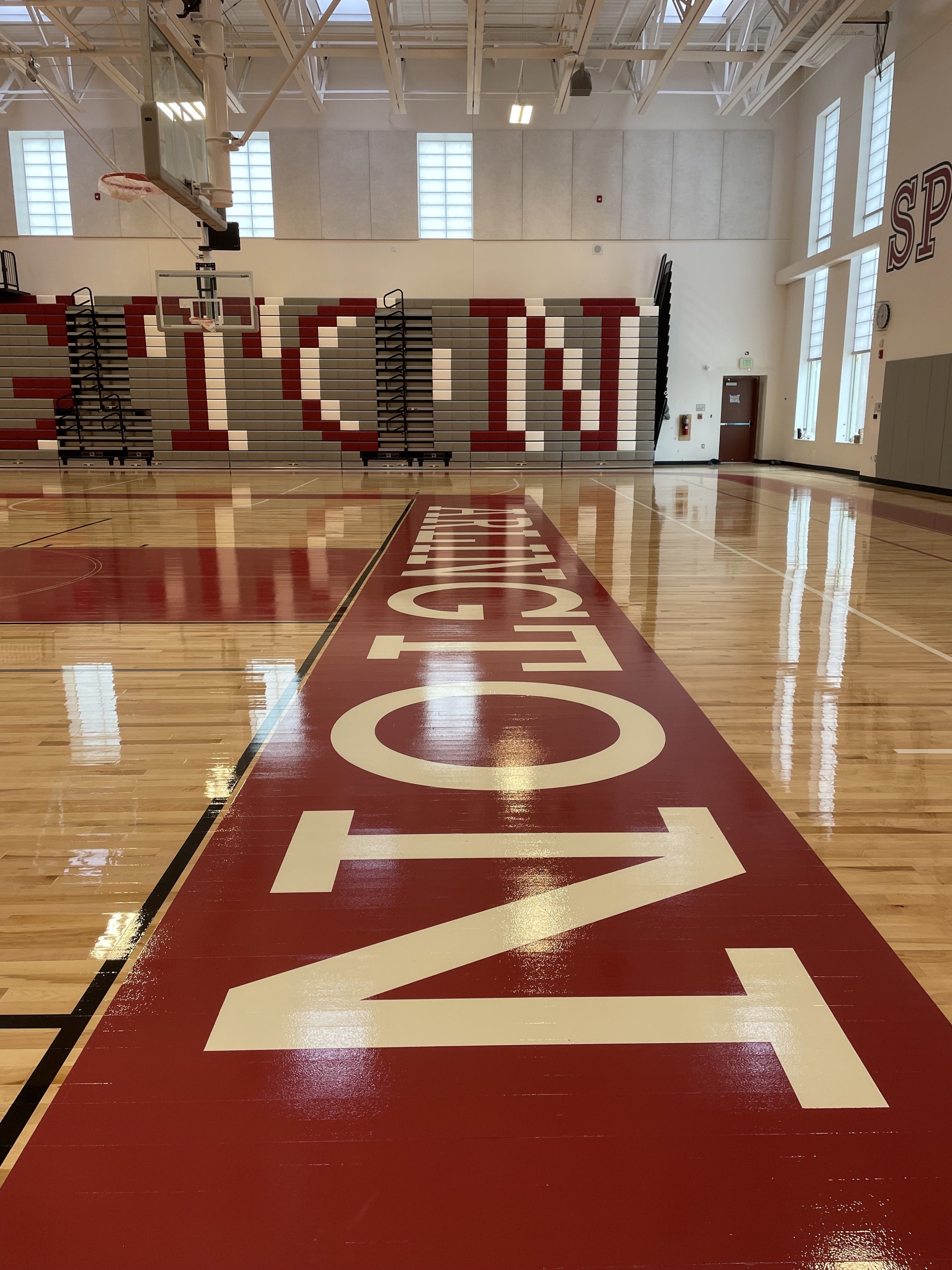
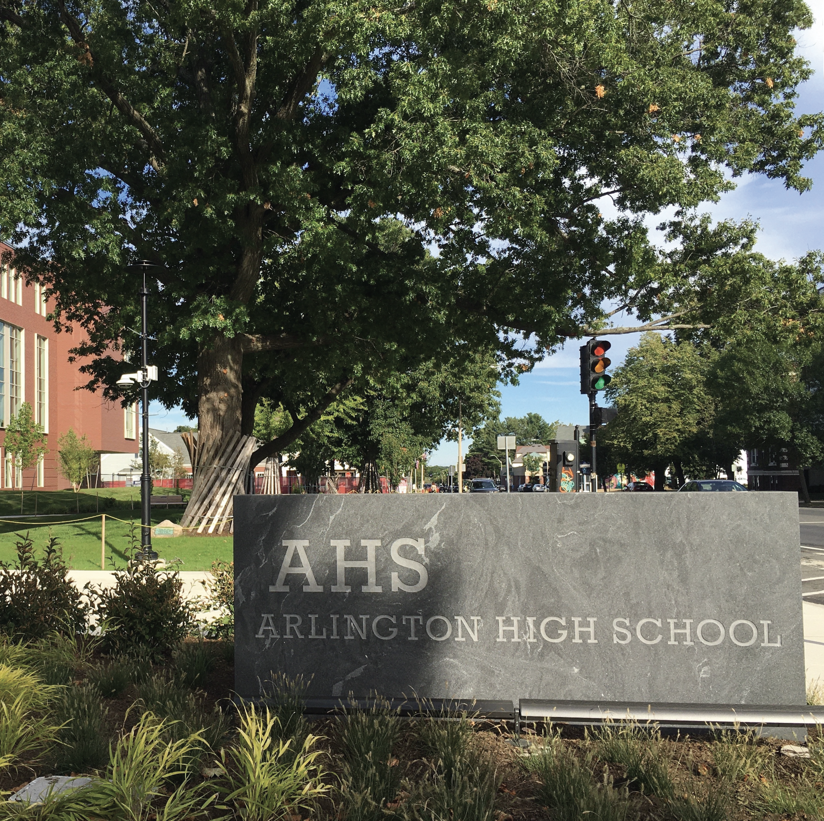
Arlington High School

12
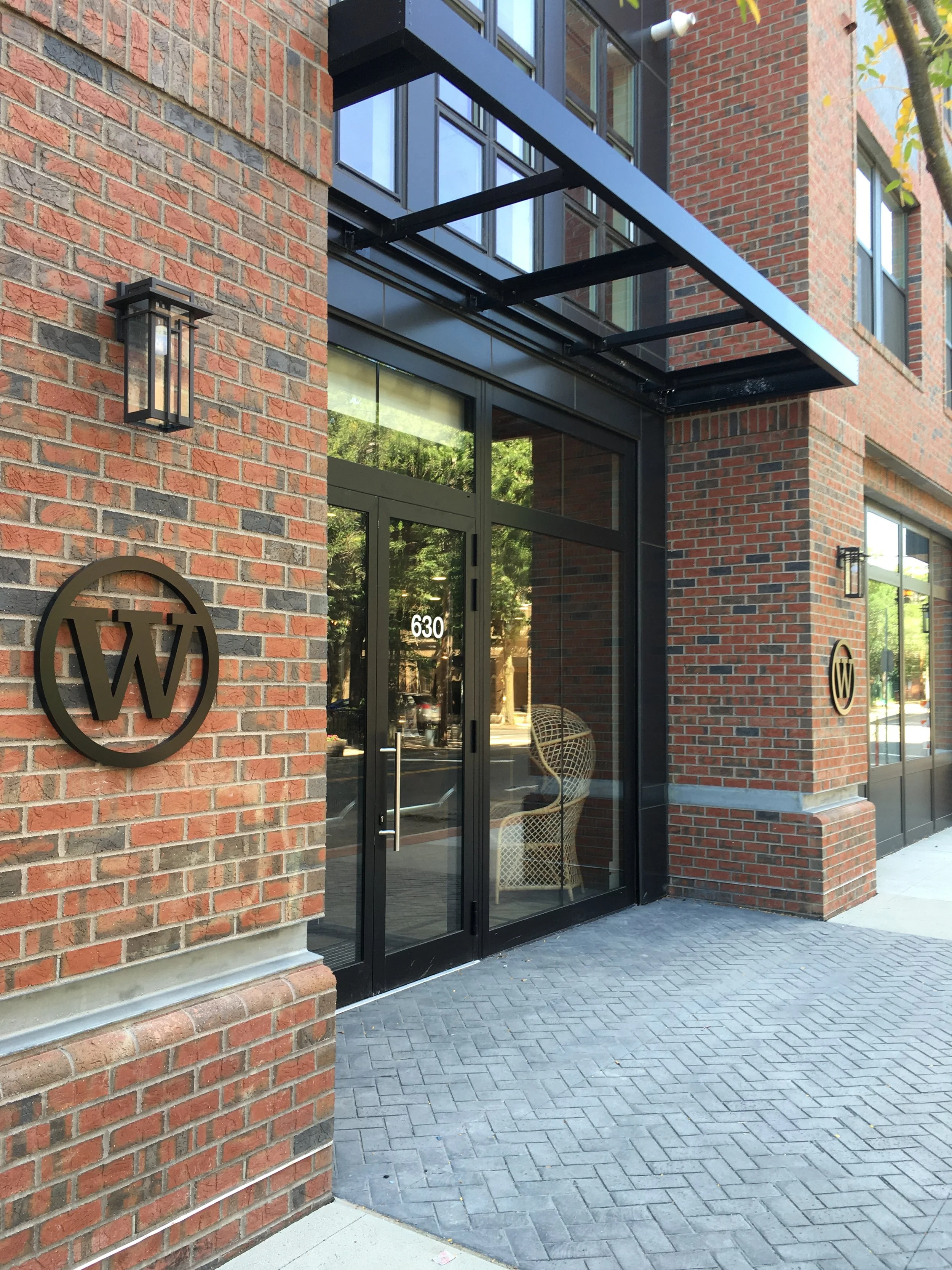
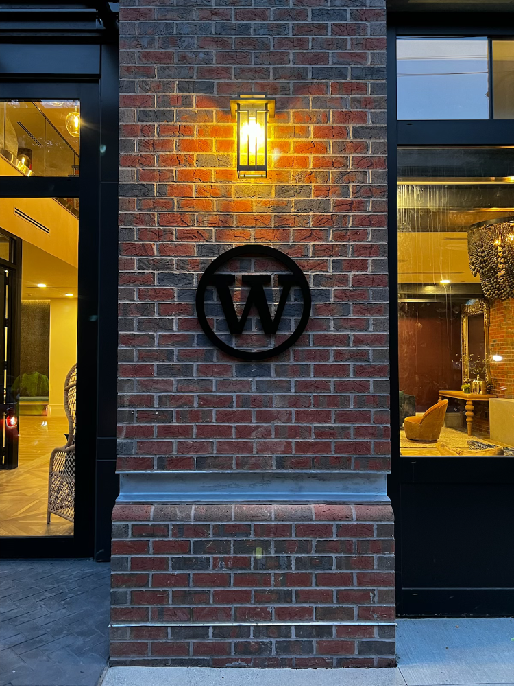
The Whit

8
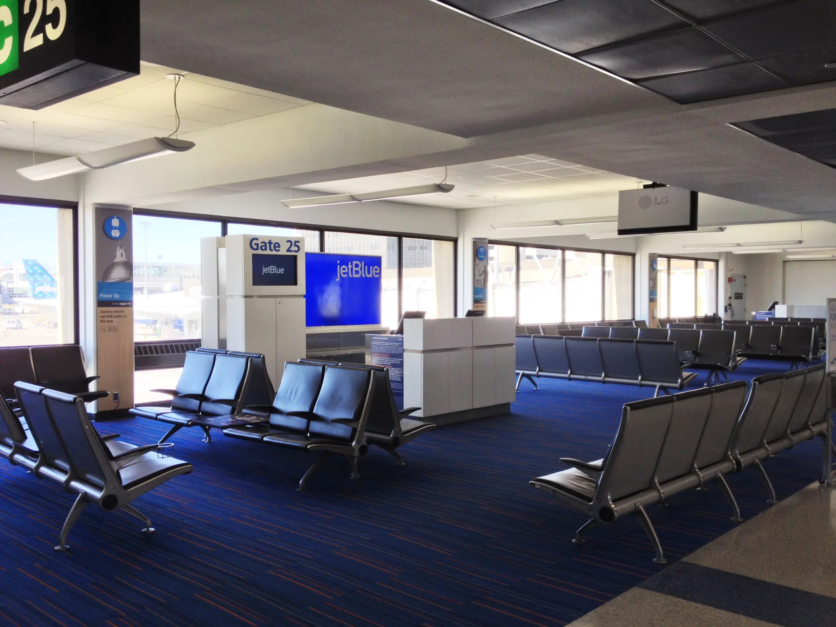
Logan International Airport
8
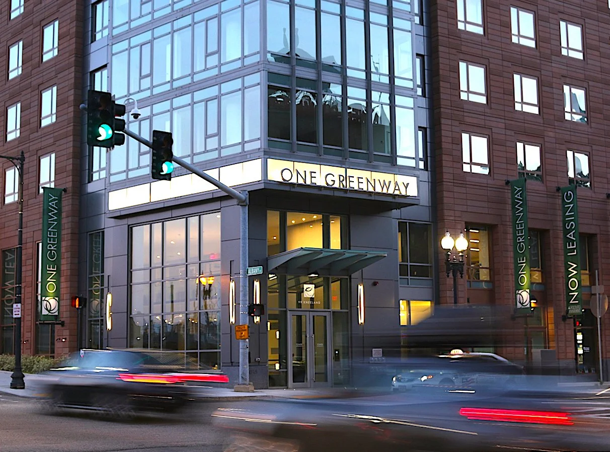
One Greenway
4
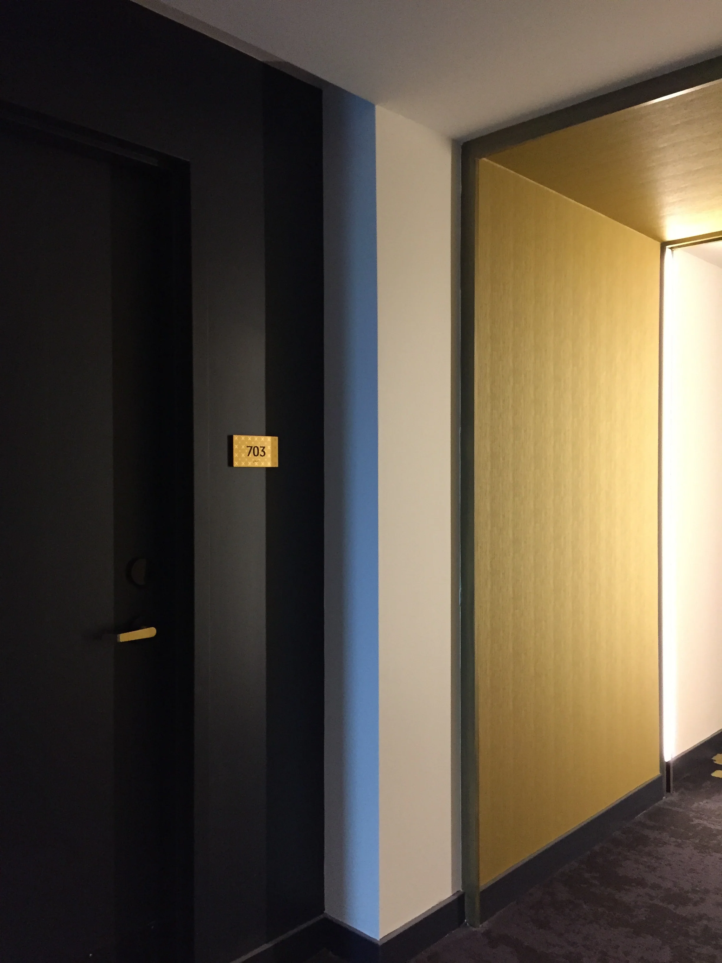
Troy Boston

10
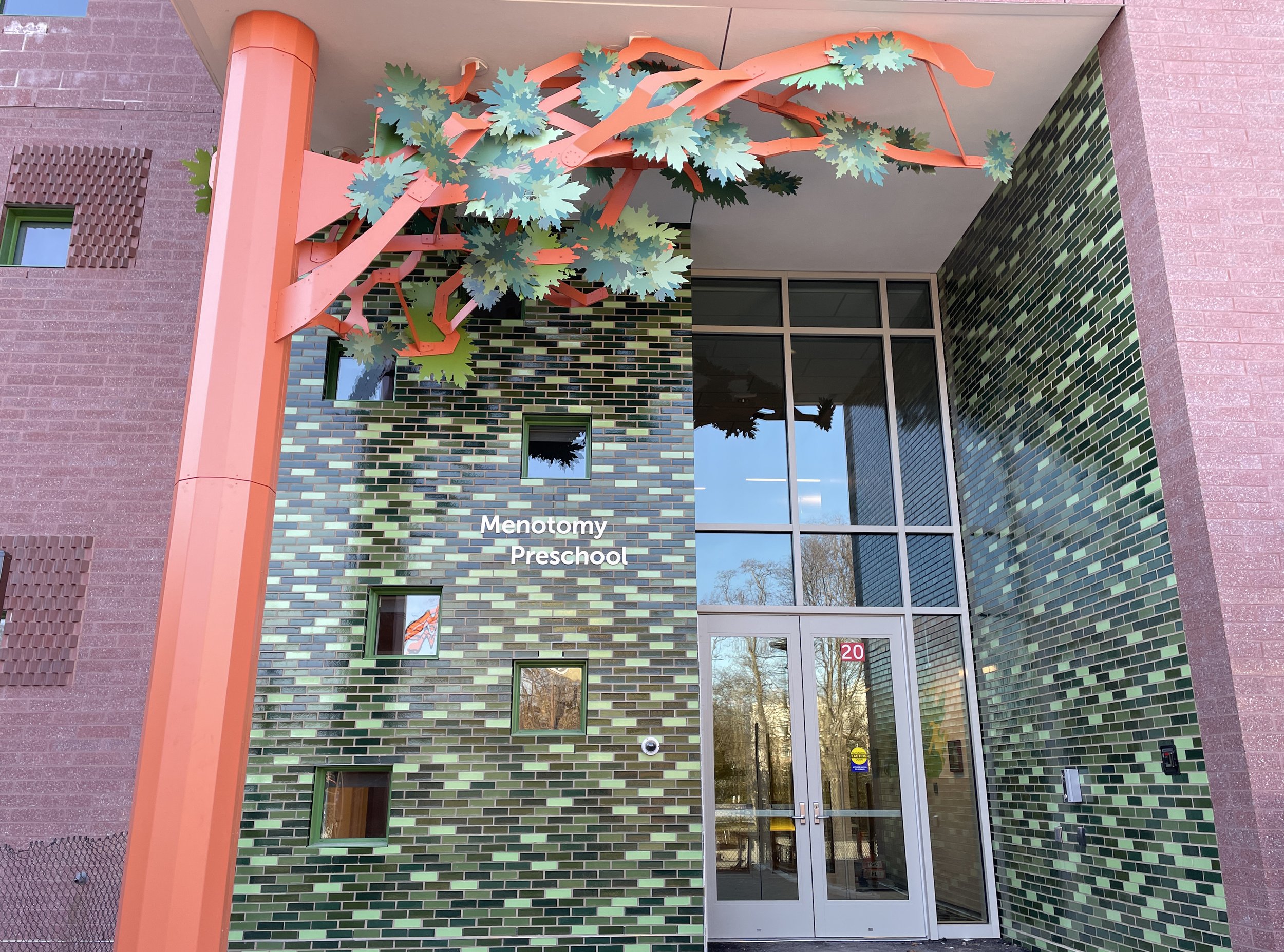
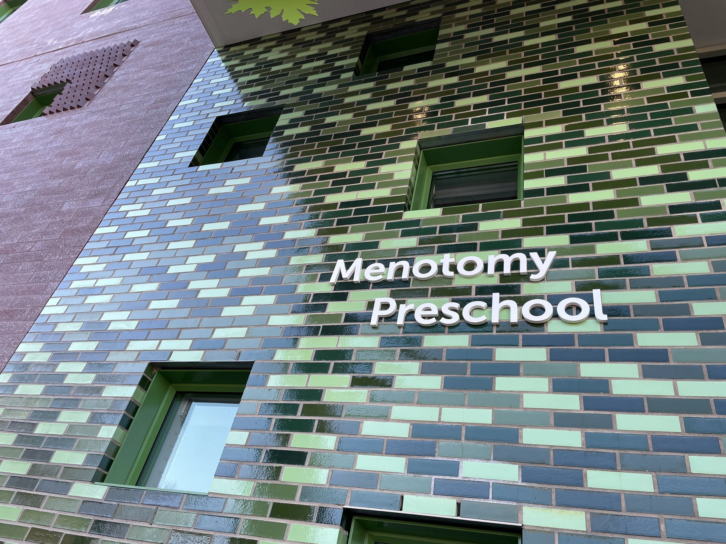
Arlington EATS

6
Meriel Marina Bay
7
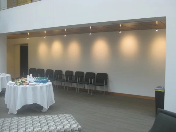
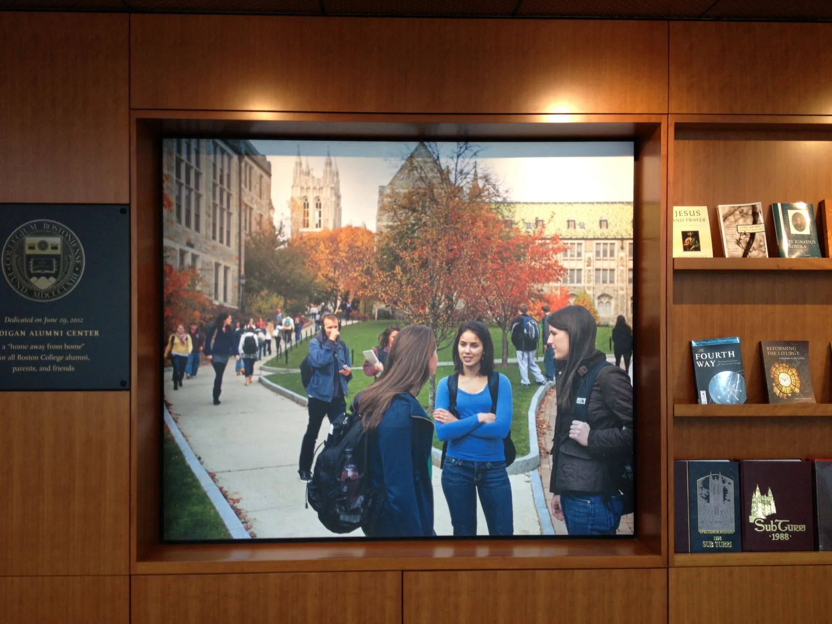
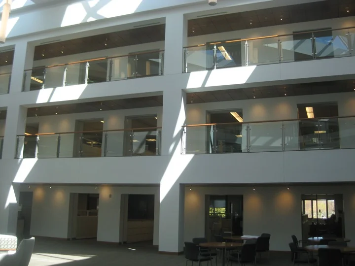
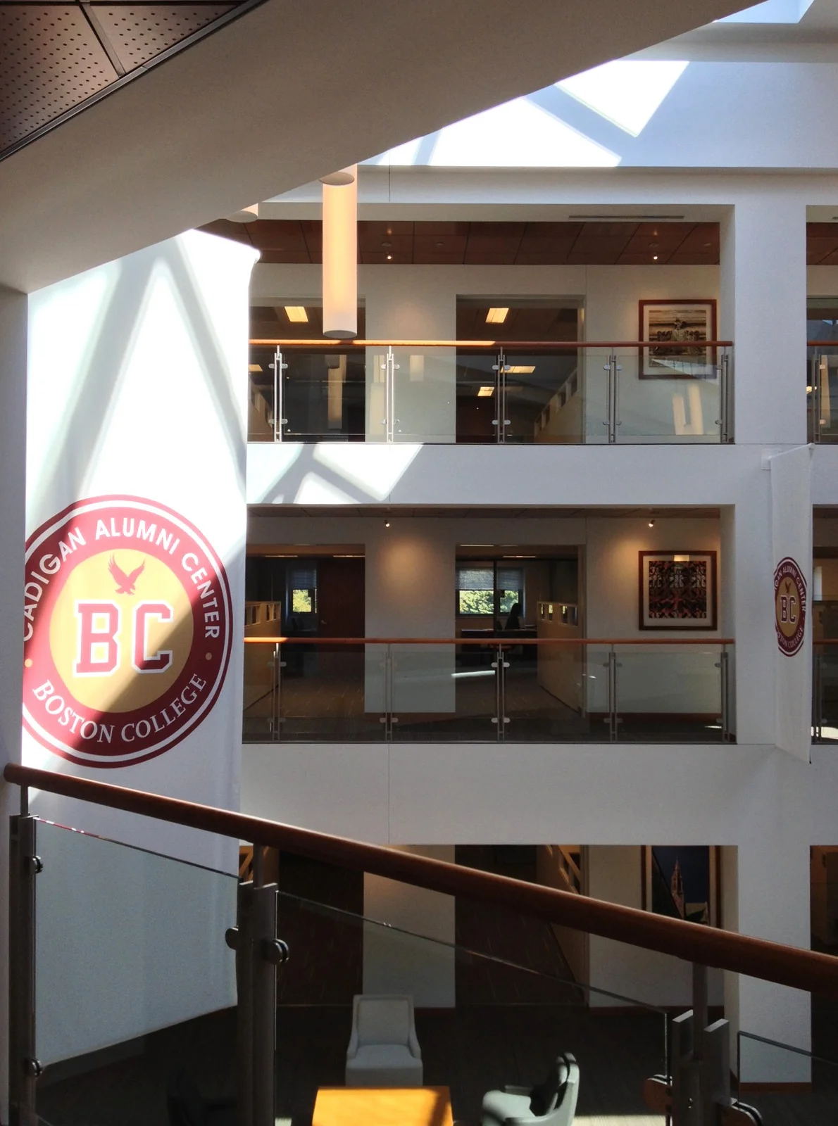
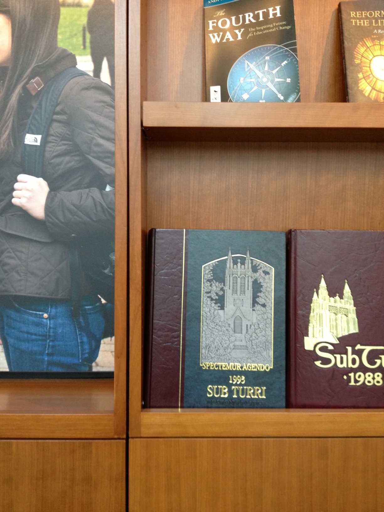
Boston College

4
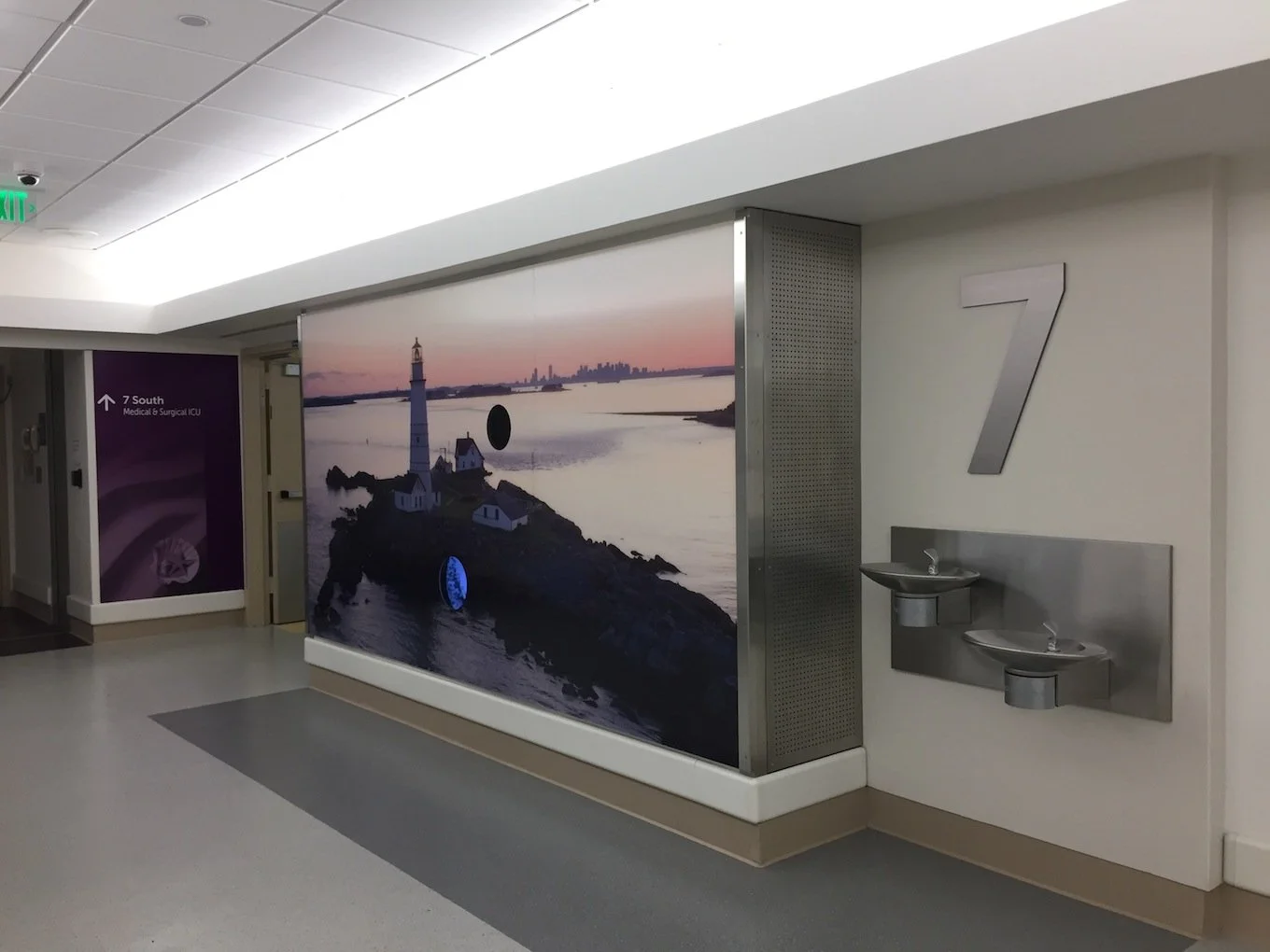
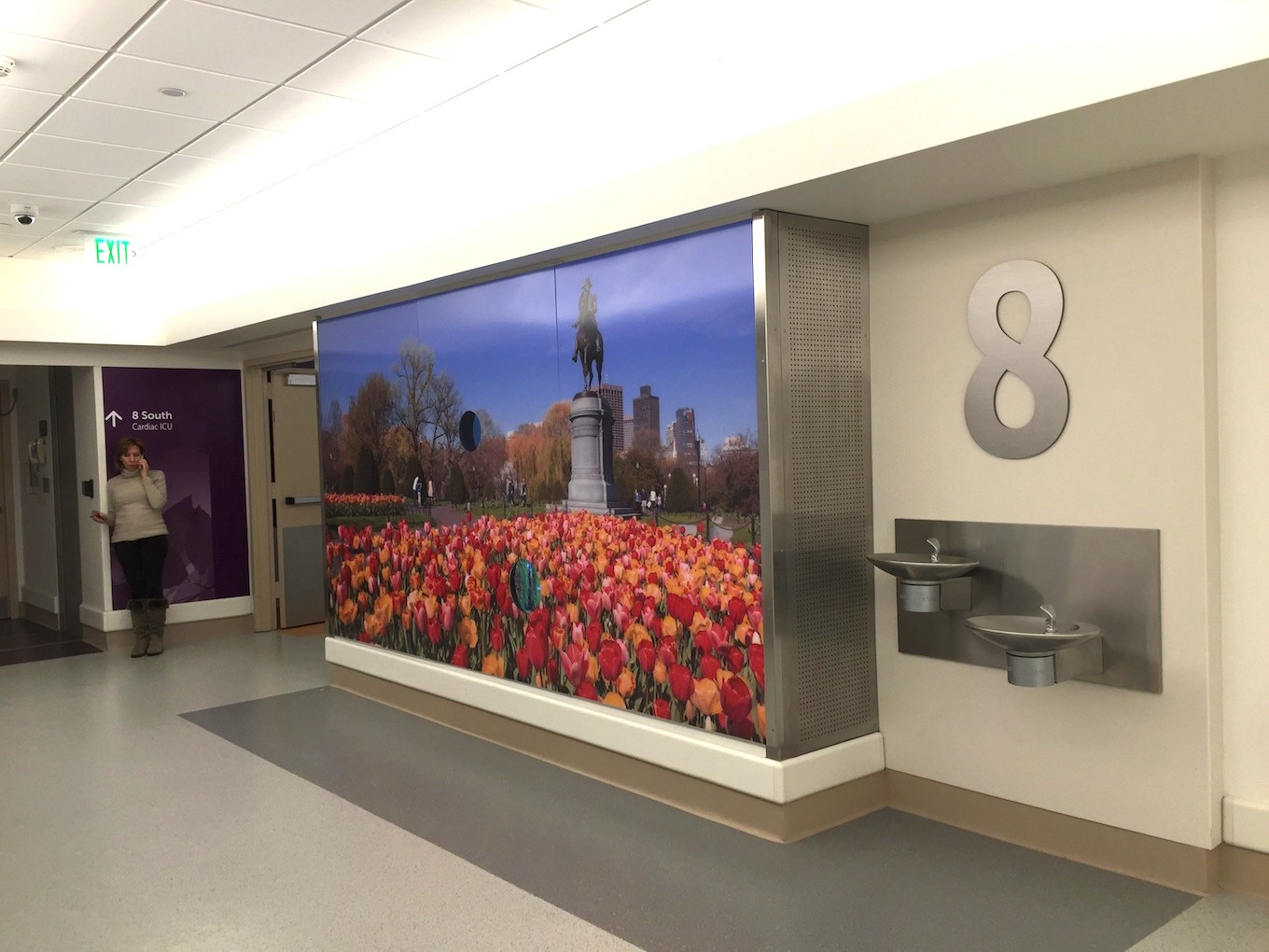
Longwood Medical Area

15
Boston Children's Primary Care Alliance

4
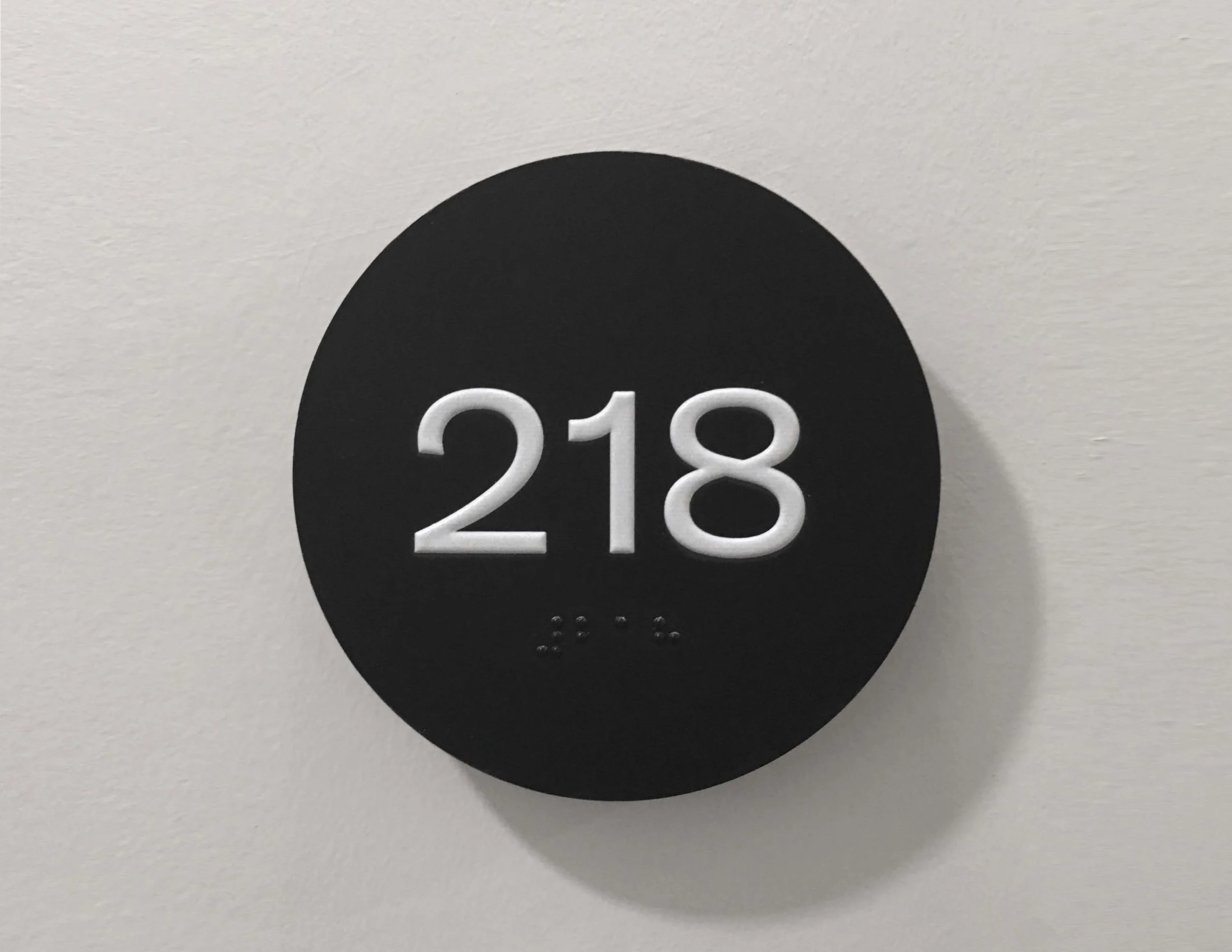
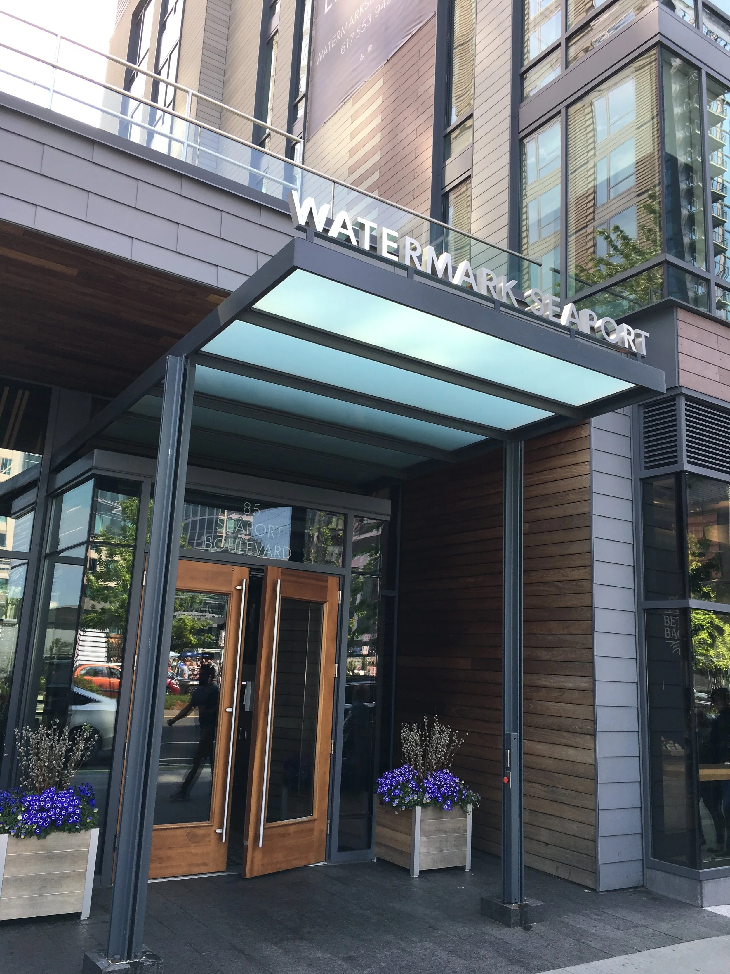
Watermark Seaport

5
Reliant Medical Group Specialty Graphics

11
Boston Children's Discovery Exhibit

5
The Heights Amesbury

2
The Mastlight